hello funky party people!

I’m not sure if you noticed, but my website url is now shorter, you can now ADD COMMENTS without being a user, and my page is much cuter. Oh you noticed? Fantastic, it worked.There are still some kinks to work out, but this’ll do for now. snoop around!

ย to celebrate, I am giving away something really nifty that I quite enjoy, overuse & endorse. It is the sugar to my tea and I thought you would love to have one, too. what COULD BE YOURS, is a Fujifilm Instax Camera & pack of film. After your 10 images are all up, don’t worry about breaking the bank…the film is much cheaper than the traditional polaroid. The photos are credit card sized and surprisingly high quality.We took ours to Sweden, this weekend on vacation and I even carry it along to weddings just for fun. you never know, right?

**just to clarify, since my sister thought I was giving away my own…I am giving away a brand NEW camera away…straight out of the box ;)**

To enter this giveaway, just LEAVE A COMMENT on THIS BLOG at the bottom of THIS POST. I seem to be shouting to emphasize that you will not be entered via facebook message, wall post, phone call, dinner invitation or email.

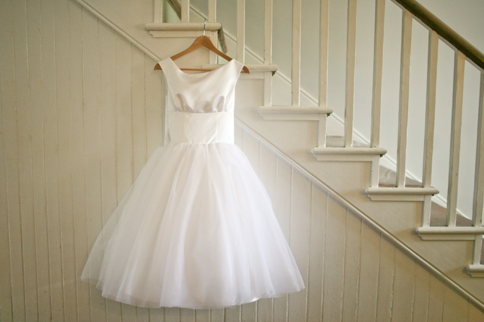
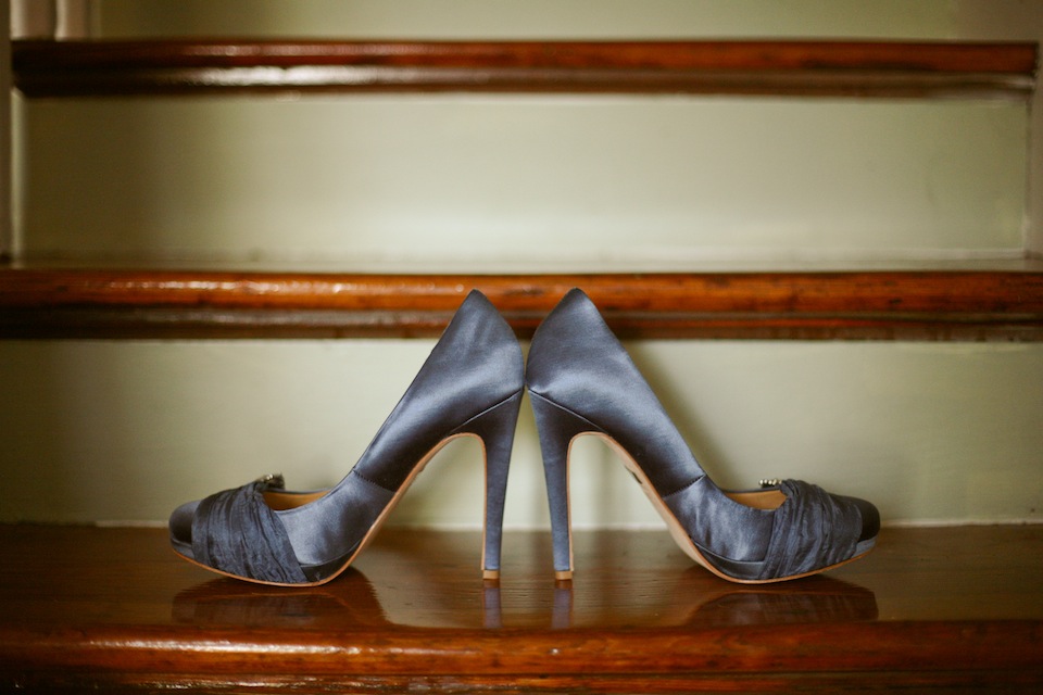
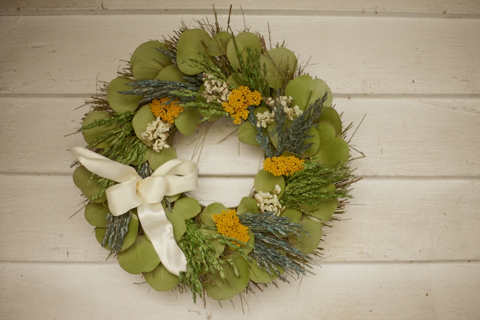
In your comment, you must VOTE for one of the three sessions below with either the entry number (one, two or three) or the session name (hayley & luke, etc.). I wasn’t sure what the very first session posted should be, so you’ll be doing me a great favor by voting for your favorite. To add an extra vote to your name, add to your comment your favorite part about the new blog. You can enter as many times as you like…but if you’re going to make me read all those votes, make em’ interesting! So, consider the polls now open. Winner will be drawn randomly and announced one week from today!


ย Oh, and here’s the video from my old blog announcing my new blog.


Hey! I’ve moved! from Kristin Partin Photography on Vimeo.

  • Patton Roark

    My vote is for session two. I like the new website because it is simple and easy to navigate!ReplyCancel

  • Ashley V

    It’s hard to pick just one!!! My vote is for Hayley + Luke :)ReplyCancel

  • I LOVE your new site! The strawberry banner at the top is adorable. I vote for #3! Adore red headed brides. ๐Ÿ˜‰ReplyCancel

  • Amelia Coulomb

    2!

    I am dying to work with you! Such talent, love the new site :)

    xoxo ACReplyCancel

  • I have to say I’m in love with #2. I’m a sucker for that farmy/country feel… It was a tough call though. Hummmm, Favorite part of the website? Hands down the adorable embroidery at the top! Muah.ReplyCancel

  • i vote for session #3ReplyCancel

  • LOVE the new blogsite, Kristin! So cute! :)ReplyCancel

  • April Newcomb

    I vote for #1. My favorite part of the new site is your super strawberry logo! And the fact that you called us funky party people ๐Ÿ˜‰ReplyCancel

  • Oh, and I vote for Jessica & Corey’s wedding to be posted first… ๐Ÿ˜‰ReplyCancel

  • Chelsy

    Hayley and Luke.

    I LOVE how you decorated your page especially your name and the little strawberry at the top ๐Ÿ˜‰ReplyCancel

  • jessica

    Three!ReplyCancel

  • Jane Butler

    I vote for number 2!!ReplyCancel

  • jessica

    Three! And i love your new banner!ReplyCancel

  • Kylie

    ONE! Blush tone bridesmaid dresses are my new fav thing. And PS, the faq section is super informative and cute. Cuformative? Informatute? I like it a whole bunch :)ReplyCancel

  • My favorite part, honestly, is the image at the top of the site. I am sucker for embroidery and lower-case cursive. I can’t remember the last time I signed anything like a grownup… it’s always all lower-case.ReplyCancel

  • Hannah

    I love session three. It is so sweet and simple and shows off the love of the couple so well. I can say the same for your new website!ReplyCancel

  • Oh, heavens. So, cute!
    I’m a friend of Rachel and Taylor and have been hooked on your photos ever since! Maybe hubbers and I will need to hire you for a baby session since we’re already married! Anywho – I’m voting for Hayley and Luke! And my favorite part of your new space is probably that embroidery on your header. Hmm…definitely coming back soon! :)ReplyCancel

  • Yuta Kanbayashi

    Session 3 is the one for me! I believe that Happiness brings the world closer together. We all share the same emotions, but to aura of happy people is uplifting. Session 3 portrays that very well.ReplyCancel

  • Melissa

    one because i LOVE the feel of the wedding!!ReplyCancel

  • Melissa

    … or three, because they’re the cutest couple ever!!ReplyCancel

  • Melissa

    and the new header, the little sewing project at the top, just too precious!ReplyCancel

  • Bethany Starin

    I vote for #2! Love the new site, kristin!ReplyCancel

  • Becky Antkowiak

    Heyyyy! SO proud of you! I like the first pic best. A good friend of mine will be calling you about maybe doing her wedding in March. I showed her your work on FB. The website didn’t seem to be working but perhaps this is why! Really like the site. Really love YOU!!!ReplyCancel

  • Jessica

    i vote for three! and my favorite thing about your site is the fact that its yours! you’re an amazing photographer and so fun to work with!ReplyCancel

  • Jessica

    my favorite thing about your site is that its yours! youre an amazing photographer and so fun to work with! an session #3!ReplyCancel

  • Victoria

    I vote for one! I love how warm you make the brick feel in the first pic!

    Also, I’m loving the new site! Especially dig the font and layout of the entries. It looks so crisp against the softness of everything else and makes your text stand out. Beautiful.ReplyCancel

  • Dena

    I vote for Jessica and Corey! Love it!! <3 My favorite part of the websites is the comfort of home feel. The embroidery on the top is SOO cute!ReplyCancel

  • megan rogers

    love your work!!! and i like number 3 :)ReplyCancel

  • emilyb

    I liked session 3 the best. It was a hard choice though, I liked all 3!ReplyCancel

  • Ciara

    I vote for one! :) love the new site and the stitching of your name! <3ReplyCancel

  • Kirstinrose

    Hello. :) So I am definitely going to vote for Hayley and Luke (one). I love the creamy loveliness and the adorable brick. Oh, and the Bride’s smile has to be a favorite of mine as well.
    Aaaaaaand I very much love your new blog/site look! SO adorable! The embroidery at the top + the strawberry in your logo makes my moment whenever I see it. :)
    Have a lovely day!ReplyCancel

  • Anna

    number three should be blogged first! i love the strawberry theme sooo cute :)ReplyCancel

  • Anna

    3! i love love love your photography kristen! its absolutely breath taking!ReplyCancel

  • Beth Matthews

    Hi Kristin! LOVE this new site! The whole look is you – adorable and approachable! I vote for session 1, although i am sure to love all 3! :) My favorite part of this new page is the revolving photos at the top – LOVE it!!!ReplyCancel

  • Ashley V

    Your new site is super cute! I like the stitched logo on top A LOT :) and I vote for all of them, but especially #2ReplyCancel

  • Tory

    I personally cannot wait for Hayley + Luke’s! But I know they are all going to be great posts full of beautiful pictures. :)ReplyCancel

  • toria tomlinson

    my vote is definitely for one. i love the theme/background/doily on top of a picnic table cloth thing you have for your background. it’s totally stellar.ReplyCancel

  • toria tomlinson

    OH! my vote is still for one. but somehow i missed the header. THAT IS SO ADORABLE. you win on several levels.ReplyCancel

  • Amanda

    three!ReplyCancel

  • Hi Kristin! I really like the new website well done! I really like the third shots myself!ReplyCancel

  • Kristin,
    Firstly, my vote is for number three. The images just really speak to my heart. Secondly, I’m LOVING the new blog. Particularly the fact that it matches your style and images so very well. Secondly, I’m LOVING this giveaway! How awesome :) I’m so excited as I would love to win this!
    Big hugs, love!ReplyCancel

  • Marla Reid

    #3 because I love her red hair. :)ReplyCancel

  • Rebekah

    I love #1- the details are so cute!! And and I love the girl’s dresses!!ReplyCancel

  • Rebekah

    And about your new blog- I love love love the lace and the red and white gingham!! The whole layout is great!ReplyCancel

  • Stephanie Miller

    I vote number three! I love the personality of this site :) It looks so natural and cozy. . my kinda site :)ReplyCancel

  • Jessica Bowen

    Well Lady, love the new look:) it is as if you had a personal stylist become your blog designer, i simply love it.
    Now as far as having to pick on you make it tough, but (number 3) is my choice… i feel the love and tenderness.

    Your photos and new blogs are lovely.

    ps. my first thought was that you were giving your own polariod away for sure… and then i read it wasn’t. I was going to say that i was quite surprised you would.ReplyCancel

  • Candice

    Jessica and Corey!! Gorgeous couple. Amazing photographer!ReplyCancel

  • You can enter as many times as you like?!? Yay! I vote for number three :) And I love the photos in your header!ReplyCancel

  • Here I am, voting again for number three. And admiring your beautiful blog. Really loving the texture of the Kristin Partin title!ReplyCancel

  • not voting, but love the new blog!! adorable!

    -KReplyCancel

  • Moriah

    session number three is definitely my favorite. not only because they look adorably in love but the bride isn’t wearing shoes in her photos. if i could live life barefoot, i totally would. and she did it in her wedding photos. way to let loose and be comfortable. (:

    btw. that pizza from your honeymoon in sweden looks delicious.ReplyCancel

  • Kayla Edmonds

    number one because i really like wood peiceReplyCancel

  • Kayla Edmonds

    number one….i like the changing pics at the top alotReplyCancel

  • Kayla Edmonds

    number one….i also really like the sewn name and strawberry! instantly got my attention and i tought “that is so cute i with i could do stuff like that”ReplyCancel

  • Carey Glenn

    Hey!

    I love your new site! it makes me wanna go on a picnic!! :]
    my vote is for jessica and cory. the first picture is so perfect with them in the center on the path the grass just draws your eyes directly to them and her dress is simple but so elegant.

    i just love everything :]ReplyCancel

  • #2

    I love the rustic feel and the play with the sunlight. Very beautiful pictures.ReplyCancel

  • Love the new website — so cute! I love the 2nd session; simply lovely!ReplyCancel

  • Laura

    Your photos are wonderful. And Three.ReplyCancel

  • Laura

    Number Two is also fantastic. Geeeeez.ReplyCancel

  • Anna

    3! 3! 3! can’t wait to see the rest of this wedding.ReplyCancel

  • Katie C

    #3!
    I love the new website! Very adorable and easy to navigate. Your photography is amazing!ReplyCancel

  • such a hard decision….but i vote for ONE! and i think your overall color-scheme/feel of the new blog is my favorite. :) so pretty and well done!

    love it all!ReplyCancel

  • Hayley

    My vote is for Hayley & Luke! A. because you made a city wall look warm and inviting and B. because the wood engraving is looking mighty pretty in my living room right now:) But I have too say that I’m very excited about session #3. and I LOVE the country feel on your new site:)ReplyCancel

  • Rachel Valarik

    i choose one :))) … I really like the way you edited them because it accents a feminine yet almost worn side. The backdrop is weathered and distressed, and it was a great place for pics. PLUS the carved tree thing is adorable ha ha. Amazing job girl!!!ReplyCancel

  • Rachel Valarik

    AND as for the new blog… the stitched logo at the top is a winner for me. hands down. and the lace sides? seriously? im sold.ReplyCancel

  • lauren lee

    I vote for TWO! Love the up close portrait…(similar to the one with rach on the piano) also like the lighting in the field! Your web site is ultra cute. love the traditional checks and the embroidery is adorable at top!ReplyCancel

  • lauren lee

    Once again I vote TWO. I like the photo’s (certain ones in particular) flashing at top. Great way to update your site with new photo’s!ReplyCancel

  • lauren lee

    Yea NUMBER TWO. The other thing I like about your site is that it is well organized and easy to navigate. You have all of the important tabs visible on the front page and people can click on them based on their interest/need.ReplyCancel

  • jessica

    I vote for session three! Love the new blogReplyCancel

  • Hannah Brock

    I’m commenting again just to say that I really really love the third session. Just the idea of an anniversary session in and of itself is so sweet!ReplyCancel

  • Hannah Brock

    Also I love how easy your site is to navigate now! very helpful:)ReplyCancel

  • hannah

    I love the homey feel to the new website! I love session three because they look so in love and the photography shows ot all! Number three! Jessica. And cory!ReplyCancel

  • cathy

    My vote goes. To #3. Jessica and corey!ReplyCancel

  • Carey Glenn

    i vote for number 3.
    i love the light in them its perfect
    and the one picture where shes looking over her shoulder is my favorite :]ReplyCancel

  • Tara Cothren

    Love number 3 :)ReplyCancel

  • Kristen Call

    KristIn,

    My vote goes to……. Number 1! Why? because I love the fact that the bride did off white bridesmaid dresses! I have always wanted to do that! I think it looks amazing together!ReplyCancel

  • Kristen Call

    KristIn,

    Though this may be a longgg waysss aaawwayyy.. I just want you to know.. when i do get married ( a billion years from now).. I would LOVE for you to do the photography at my wedding.. haha i know its way in advance.. but im sure you saw it coming.. hahahhaReplyCancel

  • I love session number three! Your new website updates are great. I love the layout. The pictures on the top are a great thing for client to see first. I love the country look. I also think it’s easier to understand and navigate. Great job!ReplyCancel

  • dorothy

    I love the embroidered banner! I vote for jessica and coreyReplyCancel

  • yahni

    i love love love ur new web page!!!

    and i gotta vote for session 3~! its sooooo awesome with the rain and the colors it seems like a dream so soft and lovley!

    keep doing what ur doing bc ur awesome at it!!

    xoxo yahniReplyCancel

  • Arielle Whitt

    I vote #3 Jessica and Cory. and I absolutely love the embroidered name and the colorsReplyCancel

  • Arielle Whitt

    I actually just saw one of these cameras for the first time at a wedding on Saturday and thought it was such an amazing thing! I love Polaroid but can’t bare the price so this thing is so amazing!!!!!ReplyCancel

  • Darling Kristin,

    I realllyyyy reallyyyyyyy want to win this, and since we can enter as many times as we like I must apologise in advance for the amount of comments you are about to get from me. It may feel spammy. Just warning you ;).

    Voting for number 3. Loving the checkered pattern on the blog!

    BIG HUGS!ReplyCancel

  • Voting for number 3. Loving the cute strawberry on the blog!ReplyCancel

  • Voting for number 3. Loving the cute strawberry underneath each entry title on the blog!ReplyCancel

  • Voting for number 3. Loving the fact that you are using ProPhoto on the blog! (I use them too they are the BEST)ReplyCancel

  • Voting for number 3. Loving the images on the blog!ReplyCancel

  • Voting for number 3. Loving whichever actions you are using on the images on the blog!ReplyCancel

  • Voting for number 3. Loving how the strawberry matches the pattern of the background on the blog.ReplyCancel

  • Voting for number 3. Loving how the content is surrounded by that cute border on the blog.ReplyCancel

  • Voting for number 3. Loving your “about” section on the blog.ReplyCancel

  • Voting for number 3. Loving your “about” section photo on the blog.ReplyCancel

  • Voting for number 3. Loving the fact that it is now much to easier comment on your blog.ReplyCancel

  • Voting for number 3. Loving that you have a search function on the blog. (lots don’t and I find it very annoying) :)ReplyCancel

  • Voting for number 3. Loving how easy it is to comment on the blog.ReplyCancel

  • Voting for number 3. Loving the fonts on the blog.ReplyCancel

  • Voting for number 3. Loving the social media integration on the blog.ReplyCancel

  • Voting for number 3. Loving the “twitter” sign on the left hand side of the blog.ReplyCancel

  • Voting for number 3. Loving the comment section on the blog.ReplyCancel

  • Voting for number 3. Loving that the archives go all the way back to June 2009 on the blog.ReplyCancel

  • Voting for number 3. Loving all the different pages on the blog.ReplyCancel

  • Voting for number 3. Loving the “FAQ” page on the blog.ReplyCancel

  • Voting for number 3. Loving the section that covers your favourite vendors on the blog.ReplyCancel

  • Voting for number 3. Loving your “What’s in my bag?” section on the blog.ReplyCancel

  • Voting for number 3. Loving that you have some very nice lenses listed on your What’s in my bag section the blog.ReplyCancel

  • Voting for number 3. Loving the colour scheme of the blog.ReplyCancel

  • Voting for number 3. Loving the layout of the blog.ReplyCancel

  • Voting for number 3. Loving that you are very personable on your blog.ReplyCancel

  • Voting for number 3. Loving that Rachel & Kyle gallery! So beautiful!ReplyCancel

  • Voting for number 3. Loving that you chose white as a content background colour on the blog.ReplyCancel

  • Voting for number 3. Loving the mixed textures used on the blog.ReplyCancel

  • Voting for number 3. Loving that the blog really makes your photos pop.ReplyCancel

  • Voting for number 3. Loving that you have more than 100 comments on this blog post.ReplyCancel

  • Voting for number 3. Loving that the first 20 comments on the top of your comment section are from me. ๐Ÿ˜‰ReplyCancel

  • Voting for number 3. Loving that you are doing this giveaway on your blog!ReplyCancel

  • Voting for number 3. Loving that I can comment on your blog without having to sign into anything :)ReplyCancel

  • Voting for number 3. Loving that your blog has a search function!ReplyCancel

  • Voting for number 3. Loving that your blog looks original.ReplyCancel

  • Voting for number 3. Loving that your blog represents you and your images beautifully.ReplyCancel

  • Voting for number 3. Loving that the colours of your photos beautifully go with the colours of your blog.ReplyCancel

  • Voting for number 3. Loving the fact that I can quickly leave a comment without having to venture to another page and having to wait for that to load a second time.ReplyCancel

  • Voting for number 3. Loving that the composition of everything on the page of the blog.ReplyCancel

  • Voting for number 3. Loving that your images are so huge on the page – centre of attention.ReplyCancel

  • Voting for number 3. Loving that we both use ProPhoto for our blogs!ReplyCancel

  • Voting for number 3. Loving that the blog is very easy to navigate!ReplyCancel

  • Voting for number 3. Loving that the new blog is very easy to read and view.ReplyCancel

  • Voting for number 3. Loving that the new blog is visually appealing.ReplyCancel

  • Voting for number 3. Loving that the new blog is so unique.ReplyCancel

  • Voting for number 3. Loving that the new blog seems to represent you very well.ReplyCancel

  • Voting for number 3. Loving that I’ve probably left the most comments on this beautiful new blog than anyone else ๐Ÿ˜‰ReplyCancel

  • Voting for number 3. Loving that the new blog was introduced to the world with a bang – awesome giveaway!ReplyCancel

  • Voting for number 3. Loving that the new blog is pretty.ReplyCancel

  • Voting for number 3. Loving that the new blog is warm & friendly to new, potential clients.ReplyCancel

  • Voting for number 3. Loving that the new blog works like a charm!ReplyCancel

  • Voting for number 3. Loving that the new blog is beautifully organised.ReplyCancel

  • Voting for number 3. Loving that the new blog is family friendly :)ReplyCancel

  • Voting for number 3. Loving that the new blog is so wonderfully pretty.ReplyCancel

  • Voting for number 3. Loving that the new blog is photographer friendly :)ReplyCancel

  • Voting for number 3. Loving that the new blog is very easy to love. <3ReplyCancel

  • Voting for number 3. Loving that the new blog is so much fun for photographers to look at for inspiration!ReplyCancel

  • Voting for number 3. Loving that the new blog is colourful, but not distracting.ReplyCancel

  • Voting for number 3. Loving that the new blog is modern and easy to use.ReplyCancel

  • Voting for number 3. Loving that the new blog is RSS friendly.ReplyCancel

  • Voting for number 3. Loving that the new blog is easy to subscribe to!ReplyCancel

  • Voting for number 3. Loving that the new blog is your home hub for sharing all of your gorgeous creations.ReplyCancel

  • Voting for number 3. Loving that the new blog is brand spankin’ new !ReplyCancel

  • Voting for number 3. Loving the colours of the new blog!ReplyCancel

  • Voting for number 3. Loving the laid back feel of the new blog.ReplyCancel

  • Voting for number 3. Loving the banner on the new blog.ReplyCancel

  • Voting for number 3. Loving the down to earth feel of the new blog.ReplyCancel

  • Voting for number 3. Loving the checkered background!ReplyCancel

  • Voting for number 3. Loving the colours of the banner at the top.ReplyCancel

  • Voting for number 3. Loving that your name at the top actually looks like it’s really been sewn on.ReplyCancel

  • Voting for number 3. Loving the happy feel of the blog.ReplyCancel

  • Voting for number 3. Loving that the blog is so pretty :)ReplyCancel

  • Voting for number 3. Loving the layout of the blog!ReplyCancel

  • Voting for number 3. Loving the country feel of the blog.ReplyCancel

  • Voting for number 3. Loving the style of the blog!ReplyCancel

  • Voting for number 3. Loving the backgrounds!ReplyCancel

  • Voting for number 3. Loving that you just changed the comments section from newest to come up last and the oldest comments to appear first. :)ReplyCancel

  • Voting for number 3. Loving the spread of your blog.ReplyCancel

  • Voting for number 3. Loving the new found wide images that your new blog can have!ReplyCancel

  • Voting for number 3. Loving that the blog is so pretty :).ReplyCancel

  • Voting for number 3. Loving that the blog was introduced to the world with this AWESOME giveaway!ReplyCancel

  • Voting for number 3. Loving the pretty comment section.ReplyCancel

  • I vote for number 3. Loving that I have now taken over at least 50% of the votes (fingers crossed that I win!)ReplyCancel

When I was 15ish (I think) I had a subscription to Brio Magazine…a Christian magazine for young girls. Anyone? okay.

anyway. there was a part at the back of a particular magazine where you could fill out a bit of information about yourself and Brio would match you up with a penpal. I was excited and anxiously waited for my new friend’s letter. About two weeks later, it was there waiting for me in the mailbox. She had drawn all over the envelope and the notebook paper was lined with stickers…she drew my name in bubble letters and we started chatting about how old we were, where we lived and our favorite color. It started there…and we have corresponded via posted mail for years. No phone calls, no texting, no email…only hand-written letters and the occasional thoughtful gift. there are a ton! I have never heard her voice…I’ve seen pictures but never met her. She is very special to me. I know about her family, where she’s lived, I know a bit about all 17 boys she’s introduced me to in words and I know that she’s a rock climbing extraordinaire. When we first started writing she lived in Huntington Beach, California…and we have the (almost) same birthday. We are the same age…and we found that so amusing. I still do, actually. Complete strangers, but I know her. She is very dear to me.

all that to say….I GET TO MEET HER TONIGHT! She is here, in MY town! In the words of my julie friend, ‘I get to finally find out if you’re a pretty photographer from virginia or a grumpy creepy old man’.

I am really so excited. Do you all think I’m weird now? crap. oh well….I don’t care what you think.

Photobucket

the necklace she made me for my birthday this year

Photobucket

cute little thing, her.

Photobucket

my wedding post card <3

I suppose there have been other times that I have focused more, edited more carefully and chosen the posting order more efficiently. However, these are from a magical time in my life and they are perfect just the way they are. I thought I’d share a few with you.We honeymooned in Bromma & Stockholm, Sweden. We stayed at the Mornington Hotel in Bromma Plan and spent our days relaxing, enduring the long walk to the closest subway and enjoying another part of the world. The food was pretty tasty, the people were kind & helpful and the weather was breezy and calm. A beautiful honeymoon with the man of my dreams.

You may be wondering about engagement & wedding photos? To save time and my sanity, here is the link to view them allllllllll. Well, the ones from my photographer, Sam Stroud.

Photobucket

Photobucket

Photobucket

Photobucket

Photobucket

Photobucket

Photobucket

Photobucket

Photobucket

Photobucket

Photobucket

Photobucket

Photobucket

Photobucket

{our hotel}

Photobucket

Photobucket

Photobucket

Photobucket

Photobucket

Photobucket

Photobucket

Photobucket

Photobucket

Photobucket

Photobucket

Photobucket

Photobucket

Photobucket

Photobucket

Photobucket

Photobucket

Photobucket

Photobucket

Photobucket

Photobucket

Photobucket

Photobucket

Photobucket

Photobucket

Photobucket

Photobucket

Photobucket

Photobucket

Photobucket

Photobucket

Photobucket

Photobucket